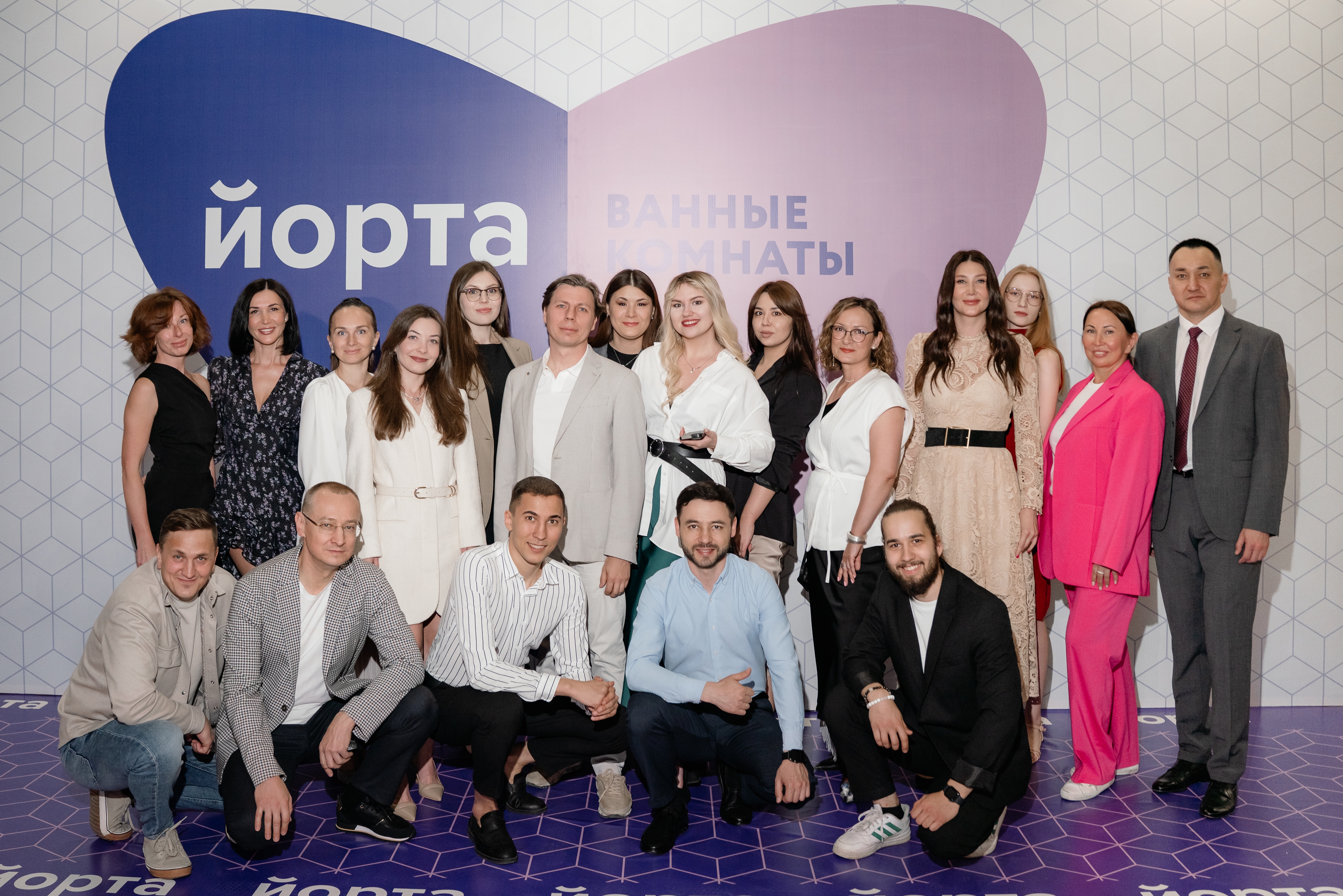
How we built a website for a leader in oil and gas education
Tiqum created a new version of the official website of Ufa State Petroleum Technological University from scratch, with its digital strategy, the needs of a university and the challenges of digital transformation in mind

We developed a modern university website: 100+ screens, a complex administration system, 10,000 items of content migrated, launched over the summer. A new UX and digital style.
The task:
Develop a new official website for Ufa State Petroleum Technological University (USPTU), with a focus on digital transformation, convenience for users, manageability for editors and a visual level matching the world's leading universities.
The reason:
The old site did not reflect the modern face of the university, was overloaded and hard to manage and did not handle communication with different audiences, from applicants to researchers. The university set the goal of presenting itself in the digital space as strongly as it does in science and education.
Develop a new official website for Ufa State Petroleum Technological University (USPTU), with a focus on digital transformation, convenience for users, manageability for editors and a visual level matching the world's leading universities.
The reason:
The old site did not reflect the modern face of the university, was overloaded and hard to manage and did not handle communication with different audiences, from applicants to researchers. The university set the goal of presenting itself in the digital space as strongly as it does in science and education.
The project to create a new website for Ufa State Petroleum Technological University began not with a mockup but with a task at the strategic level. USPTU, one of the leaders of oil and gas education in Russia, set the goal of forming a digital image of the university that meets international standards. It was a challenge for the Tiqum team too: to create not just a website but a foundation for the university's digital transformation.
Analysis and audit: the starting point
The project started with large-scale analysis. We studied more than 100 university websites, from top Russian ones to foreign ones (MIT, TU Delft, Imperial College). We identified their weak and strong points and compiled a list of features and of mistakes not to repeat. In parallel we interviewed representatives of all audiences: applicants, students, lecturers, staff, partners.
On the basis of the analysis we built profiles of target users and described the key user scenarios. As part of the UX research a customer journey map was drawn up, reflecting every possible interaction of a visitor with the site.
Analysis and audit: the starting point
The project started with large-scale analysis. We studied more than 100 university websites, from top Russian ones to foreign ones (MIT, TU Delft, Imperial College). We identified their weak and strong points and compiled a list of features and of mistakes not to repeat. In parallel we interviewed representatives of all audiences: applicants, students, lecturers, staff, partners.
On the basis of the analysis we built profiles of target users and described the key user scenarios. As part of the UX research a customer journey map was drawn up, reflecting every possible interaction of a visitor with the site.
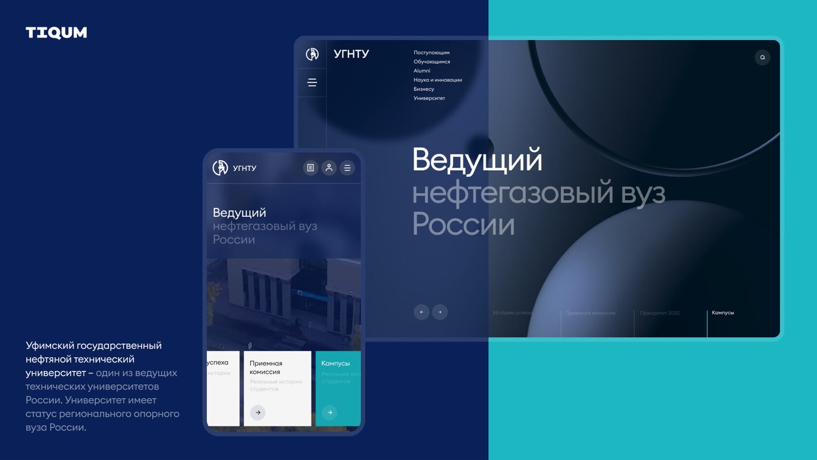
Information architecture: reassembling the chaos
The old site had developed piecemeal for more than 10 years. The structure had grown haphazardly: pages were duplicated, links led nowhere, sections overlapped. One section could be a subpage of three others, which made navigation almost impossible. A specialist manually assembled a mind map of thousands of elements, cleaned up the structure and created a logical hierarchy.
A dedicated specialist joined the UX design: we described user flows and user stories for all scenarios (from submitting application documents to publishing a research paper), which formed the basis of the prototypes.
The old site had developed piecemeal for more than 10 years. The structure had grown haphazardly: pages were duplicated, links led nowhere, sections overlapped. One section could be a subpage of three others, which made navigation almost impossible. A specialist manually assembled a mind map of thousands of elements, cleaned up the structure and created a logical hierarchy.
A dedicated specialist joined the UX design: we described user flows and user stories for all scenarios (from submitting application documents to publishing a research paper), which formed the basis of the prototypes.
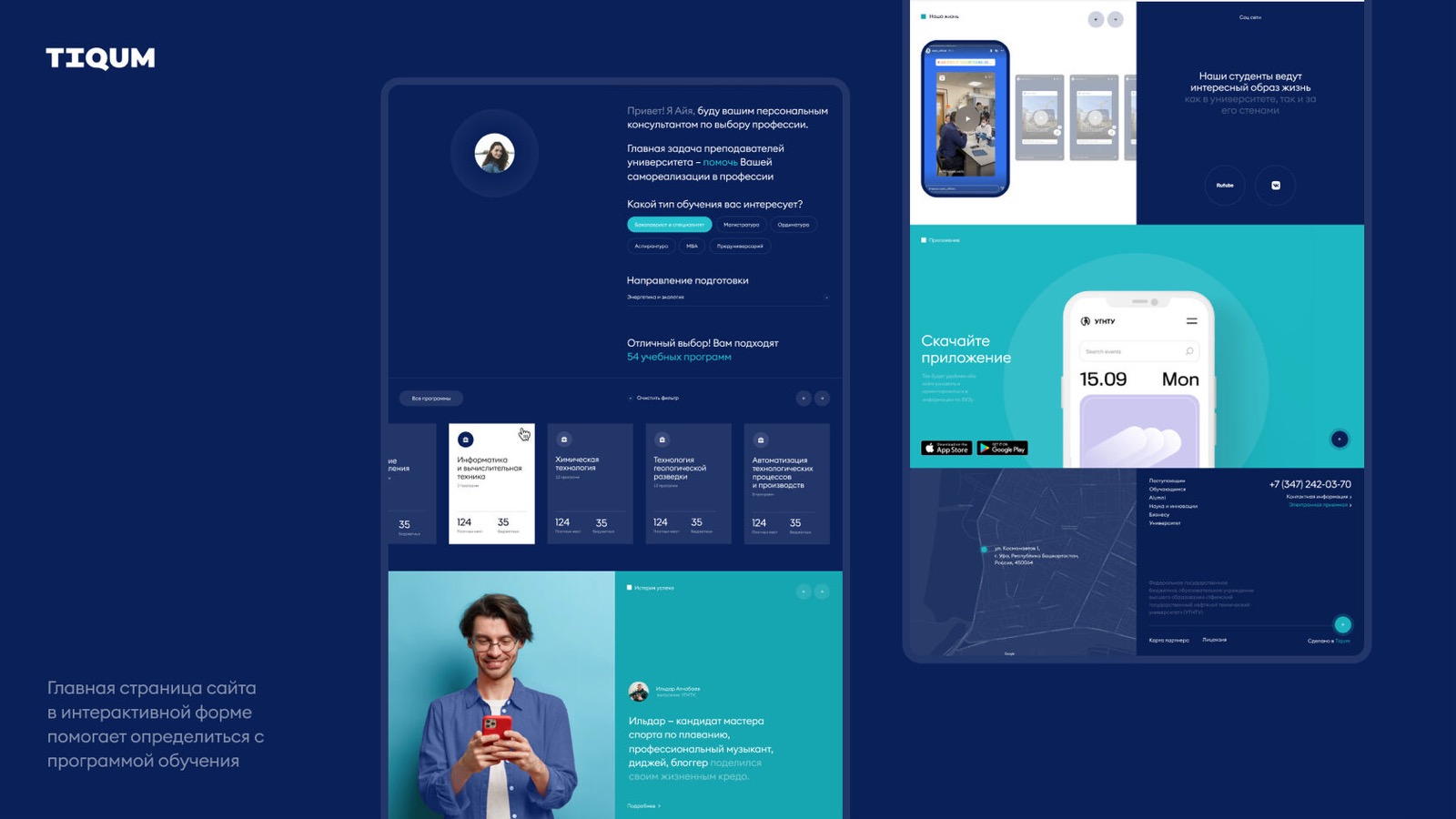
Design: the second attempt was the winner
The first visual concept, strict and corporate, was not accepted by the university's committee. The second approach was based on a fresh view: the design was proposed by a young team inspired by top educational websites and their own experience as applicants.
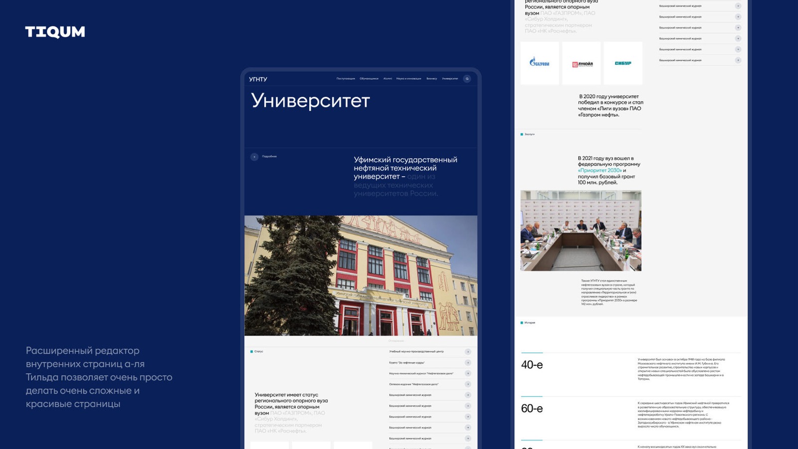
The result was a UI design with an emphasis on lightness, transparency and accessibility, but without loss of authority. A UI kit and a design system for 100+ screens were created, which sped up front-end work and standardized all components. Special attention went to readability, navigation accents and interactive elements.
The first visual concept, strict and corporate, was not accepted by the university's committee. The second approach was based on a fresh view: the design was proposed by a young team inspired by top educational websites and their own experience as applicants.
The result was a UI design with an emphasis on lightness, transparency and accessibility, but without loss of authority. A UI kit and a design system for 100+ screens were created, which sped up front-end work and standardized all components. Special attention went to readability, navigation accents and interactive elements.
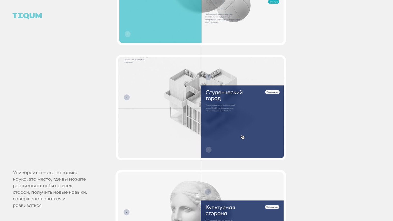
Development: at the level of digital platforms
Development was done on Symfony with server-side rendering and API modules. This ensured fast loading, SEO-friendliness and flexibility for future integration with external services.
Special attention went to the content management system. We developed:
We also successfully migrated 10,000+ items of content from the previous site, preserving the URL structure, metadata, illustrations and attachments. The migration went through without losses and with SEO redirects in place.
Development was done on Symfony with server-side rendering and API modules. This ensured fast loading, SEO-friendliness and flexibility for future integration with external services.
Special attention went to the content management system. We developed:
- administration with role-based access (for departments, moderators, deans' offices);
- a visual page builder with block templates (tables, galleries, staff, documents and more);
- a system of dashboards and notifications for the editor-in-chief.
We also successfully migrated 10,000+ items of content from the previous site, preserving the URL structure, metadata, illustrations and attachments. The migration went through without losses and with SEO redirects in place.
The human factor and unexpected turns
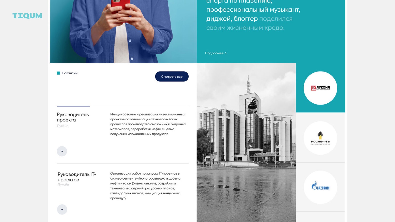
The day before launch a requirement arrived from the regional Ministry of Education: place a fixed banner about online learning on the first screen. Unexpected as it was, the team adapted quickly and made the changes on time, keeping the planned date of the public announcement.
The day before launch a requirement arrived from the regional Ministry of Education: place a fixed banner about online learning on the first screen. Unexpected as it was, the team adapted quickly and made the changes on time, keeping the planned date of the public announcement.
What matters most
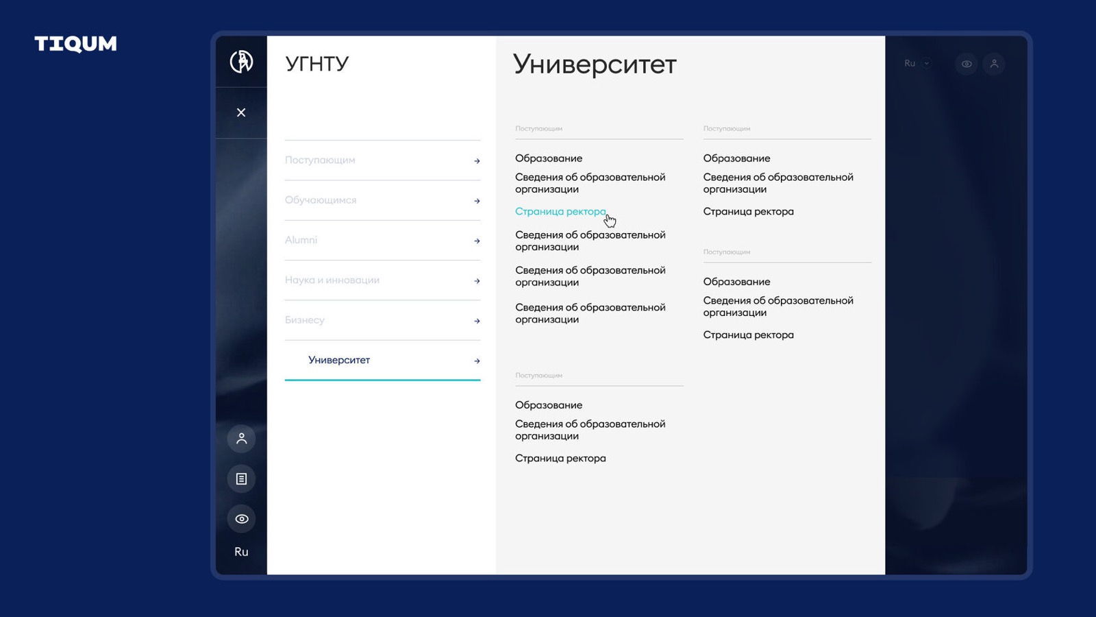
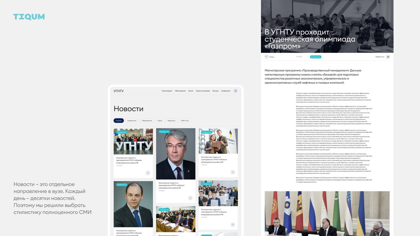
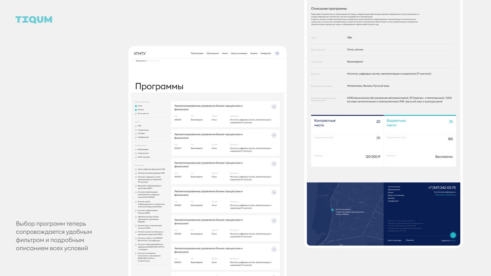
The project addresses not only communication but also internal processes. Now every department can manage its own section, and editors can assemble pages without programmers' help. The university got not just a website but a convenient working tool and media center befitting the status of the industry's flagship university.
The project addresses not only communication but also internal processes. Now every department can manage its own section, and editors can assemble pages without programmers' help. The university got not just a website but a convenient working tool and media center befitting the status of the industry's flagship university.
The result:
- The new site was officially launched on July 16 and presented by the rector on social media
- 10,000+ items of content migrated, 100+ screens designed
- Navigation and UX improved (growth in target actions recorded in web analytics)
- Every department got access to manage its own content
- A page builder was developed that needs no developers
- The university got a visual presence matching its leading position in oil and gas education
- The site received positive feedback from students, staff and partners