How we redesigned a 90-screen online store in 2.5 weeks
Tiqum carried out a UX redesign of the website of Vekprom, a major machine tool supplier, and designed more than 90 screens of a responsive online store in 2.5 weeks

We designed a responsive UX/UI for a 90-screen online store in 2.5 weeks
The task:
Create the UX design of a new website for the Vekprom industrial group, one of Russia's largest suppliers of industrial equipment. The site had to make it easy to choose and buy equipment, have a modern UI and be responsive on every type of device.
The reason:
The client had been trying to launch a redesign with other contractors for more than a year and had invested several million rubles, yet there was still no result. The company came to Tiqum hoping for a quality result on a tight schedule, and the team was ready to take the risk.
Who the client is
The Vekprom industrial group is one of the largest suppliers of machine tools and industrial equipment in Russia. Its range has more than 50,000 items, its warehouses cover over 15,000 m², and it has the country's only equipment showroom. The company's website had to reflect the scale of the business and make it easy to select and buy machinery. But after a year with two contractors and several million rubles, the project was still unfinished.
The company came to us at Tiqum with a task: develop a new website design with an emphasis on UX and a modern UI. We accepted the challenge of doing all the work in 2.5 weeks. In that time we designed 21 unique pages with responsive versions (about 90 screens in total), prepared a UI kit and completely rethought the user scenarios.
From analytics to a solution
The first stage was research: we studied user behavior in B2B and B2C e-commerce, analyzed dozens of industry and general online stores, compiled a table of patterns and collected references in a mood board. This let us create a logical site structure where every user step is clear and the navigation needs no explanation.
Easy navigation from the first click
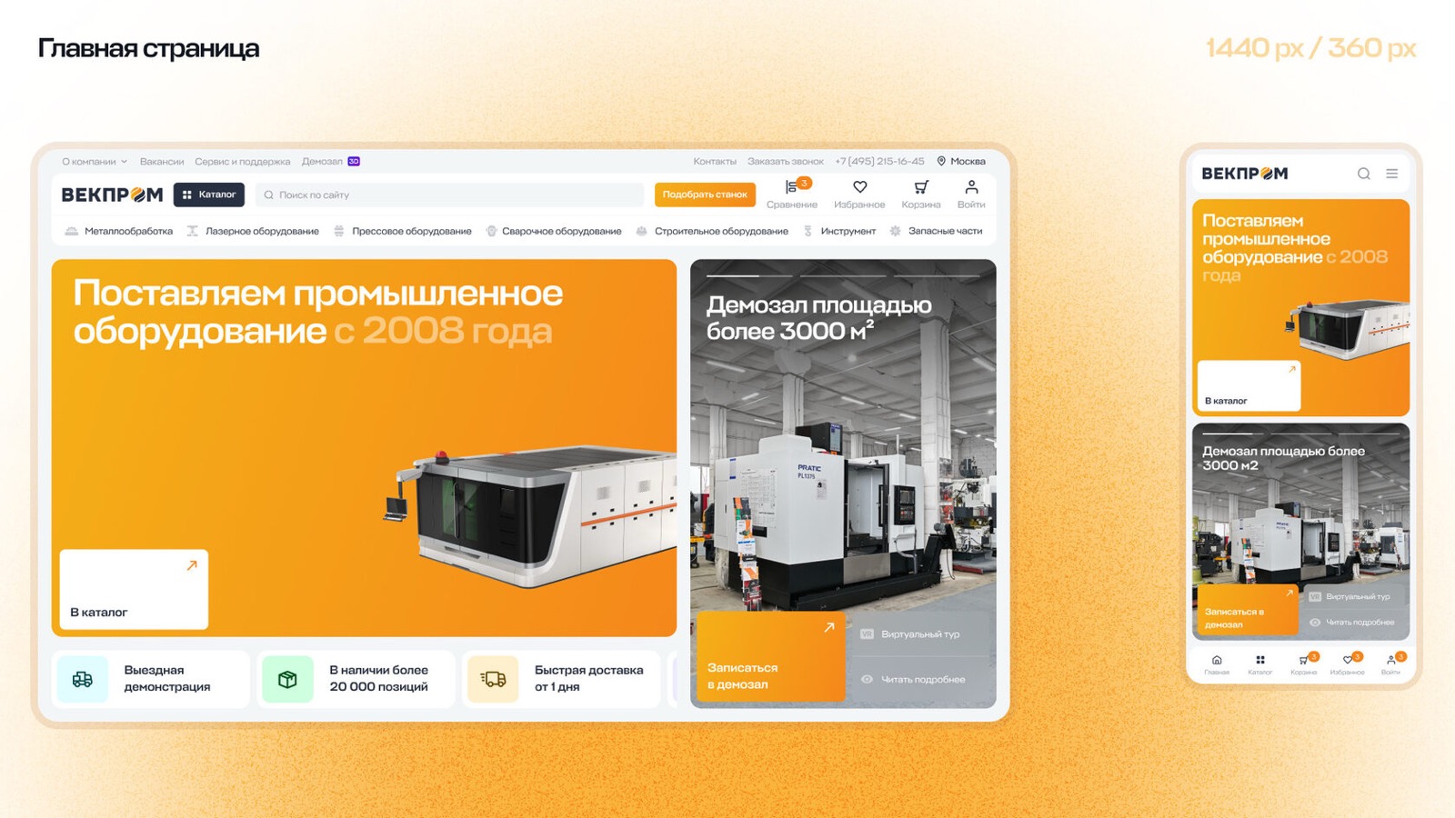
One of the hard tasks was designing the site header. It includes the catalog, search, company sections, contacts and the personal account. We added quick access to popular categories that expand on hover. The result is clear, functional navigation.
The product page as a working tool
A product card in the B2B segment is more than a photo and a price. We designed a page that can show:
The interface uses vertical tabs: sections on the left, scrollable content on the right. This makes the page easier to take in and avoids overload. We also added trust triggers: delivery, warranty, service and payment, each with a short description to remove customers' most common concerns.
Search and filtering: simple and clear
With a catalog of this size, search is critical. We placed it in the header and inside the categories. The filter shows the selected parameters at the top of the page and lets you change them quickly. This makes navigating 50,000+ products fast and intuitive.
Scalability and the UI kit
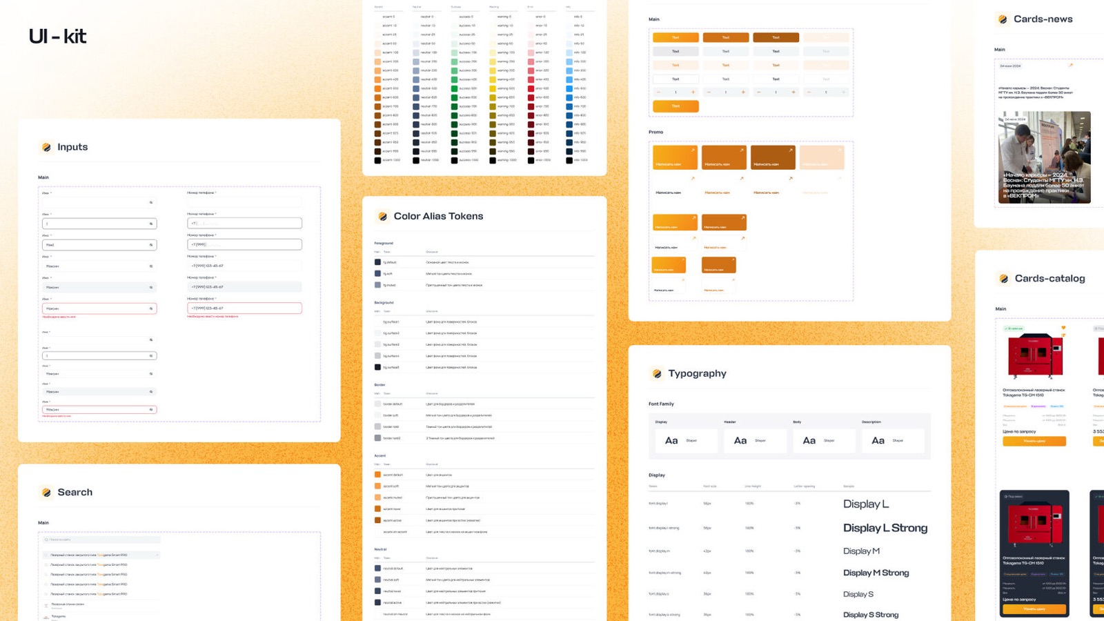
To speed up the handover of the design to development, we built a UI kit based on atomic design and design tokens. This lets the interface scale and elements be updated without developers, simply by changing tokens. The approach lowers support costs and keeps things flexible as functionality grows.
Mobile first
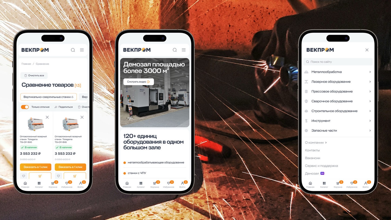
A third of Vekprom's audience comes from mobile devices, so we adapted every screen to four resolutions, from desktop to smartphone. In the mobile version the main navigation is moved to a bottom tab bar, which makes it convenient even for users with only one hand free. In look and logic, the site works like a full-fledged app.
The task:
Create the UX design of a new website for the Vekprom industrial group, one of Russia's largest suppliers of industrial equipment. The site had to make it easy to choose and buy equipment, have a modern UI and be responsive on every type of device.
The reason:
The client had been trying to launch a redesign with other contractors for more than a year and had invested several million rubles, yet there was still no result. The company came to Tiqum hoping for a quality result on a tight schedule, and the team was ready to take the risk.
Who the client is
The Vekprom industrial group is one of the largest suppliers of machine tools and industrial equipment in Russia. Its range has more than 50,000 items, its warehouses cover over 15,000 m², and it has the country's only equipment showroom. The company's website had to reflect the scale of the business and make it easy to select and buy machinery. But after a year with two contractors and several million rubles, the project was still unfinished.
The company came to us at Tiqum with a task: develop a new website design with an emphasis on UX and a modern UI. We accepted the challenge of doing all the work in 2.5 weeks. In that time we designed 21 unique pages with responsive versions (about 90 screens in total), prepared a UI kit and completely rethought the user scenarios.
From analytics to a solution
The first stage was research: we studied user behavior in B2B and B2C e-commerce, analyzed dozens of industry and general online stores, compiled a table of patterns and collected references in a mood board. This let us create a logical site structure where every user step is clear and the navigation needs no explanation.
Easy navigation from the first click
One of the hard tasks was designing the site header. It includes the catalog, search, company sections, contacts and the personal account. We added quick access to popular categories that expand on hover. The result is clear, functional navigation.
The product page as a working tool
A product card in the B2B segment is more than a photo and a price. We designed a page that can show:
- combinations of configurations,
- technical specifications,
- a description with charts and embedded video,
- blocks with additional equipment and spare parts.
The interface uses vertical tabs: sections on the left, scrollable content on the right. This makes the page easier to take in and avoids overload. We also added trust triggers: delivery, warranty, service and payment, each with a short description to remove customers' most common concerns.
Search and filtering: simple and clear
With a catalog of this size, search is critical. We placed it in the header and inside the categories. The filter shows the selected parameters at the top of the page and lets you change them quickly. This makes navigating 50,000+ products fast and intuitive.
Scalability and the UI kit
To speed up the handover of the design to development, we built a UI kit based on atomic design and design tokens. This lets the interface scale and elements be updated without developers, simply by changing tokens. The approach lowers support costs and keeps things flexible as functionality grows.
Mobile first
A third of Vekprom's audience comes from mobile devices, so we adapted every screen to four resolutions, from desktop to smartphone. In the mobile version the main navigation is moved to a bottom tab bar, which makes it convenient even for users with only one hand free. In look and logic, the site works like a full-fledged app.
The result:
- A complete responsive UX/UI design of an online store with 90+ screens in 2.5 weeks.
- Simpler further development thanks to design tokens and the atomic approach.
- Better usability and conversion on the product card thanks to a well-thought-out structure and trust triggers.
- Support for users on all devices, from large screens to smartphones.
- The client got a modern interface that is easy to work with, scale and develop.